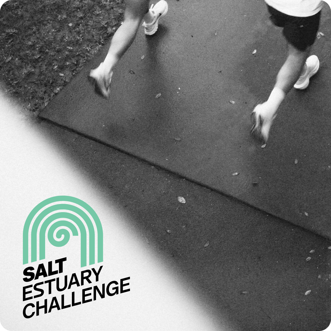
Salt
- Brand Strategy
- Brand Development
- Web Design
- Web Development
- Copywriting
- Motion Design
- Photography
- Signage
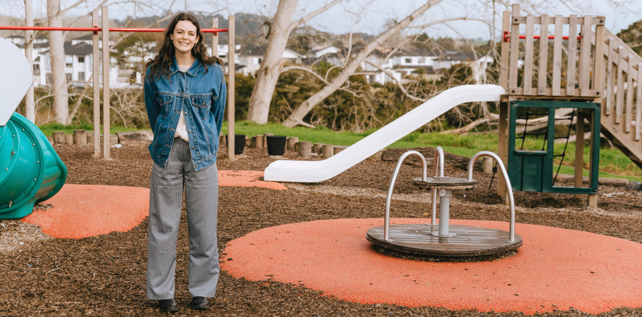
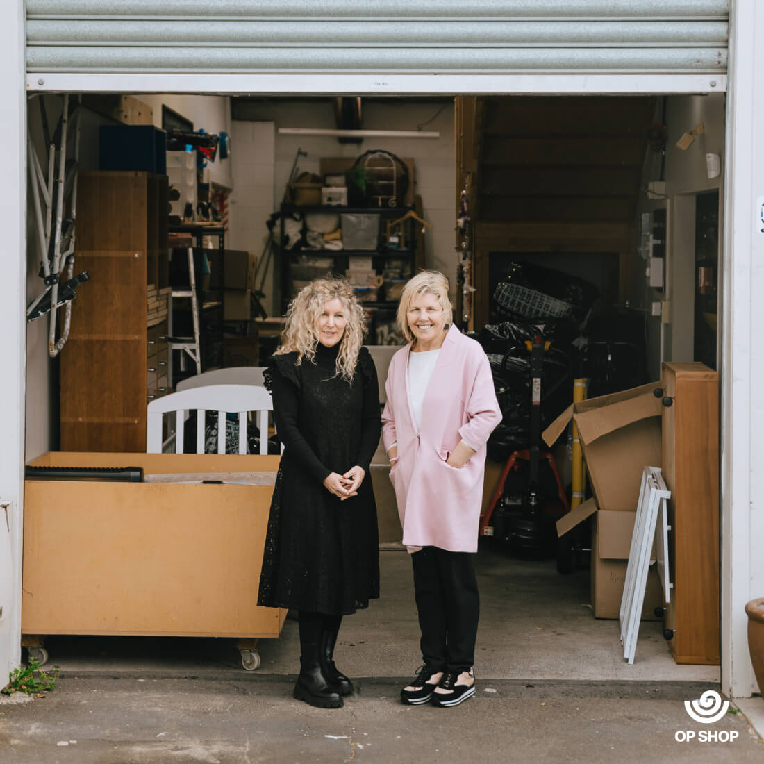
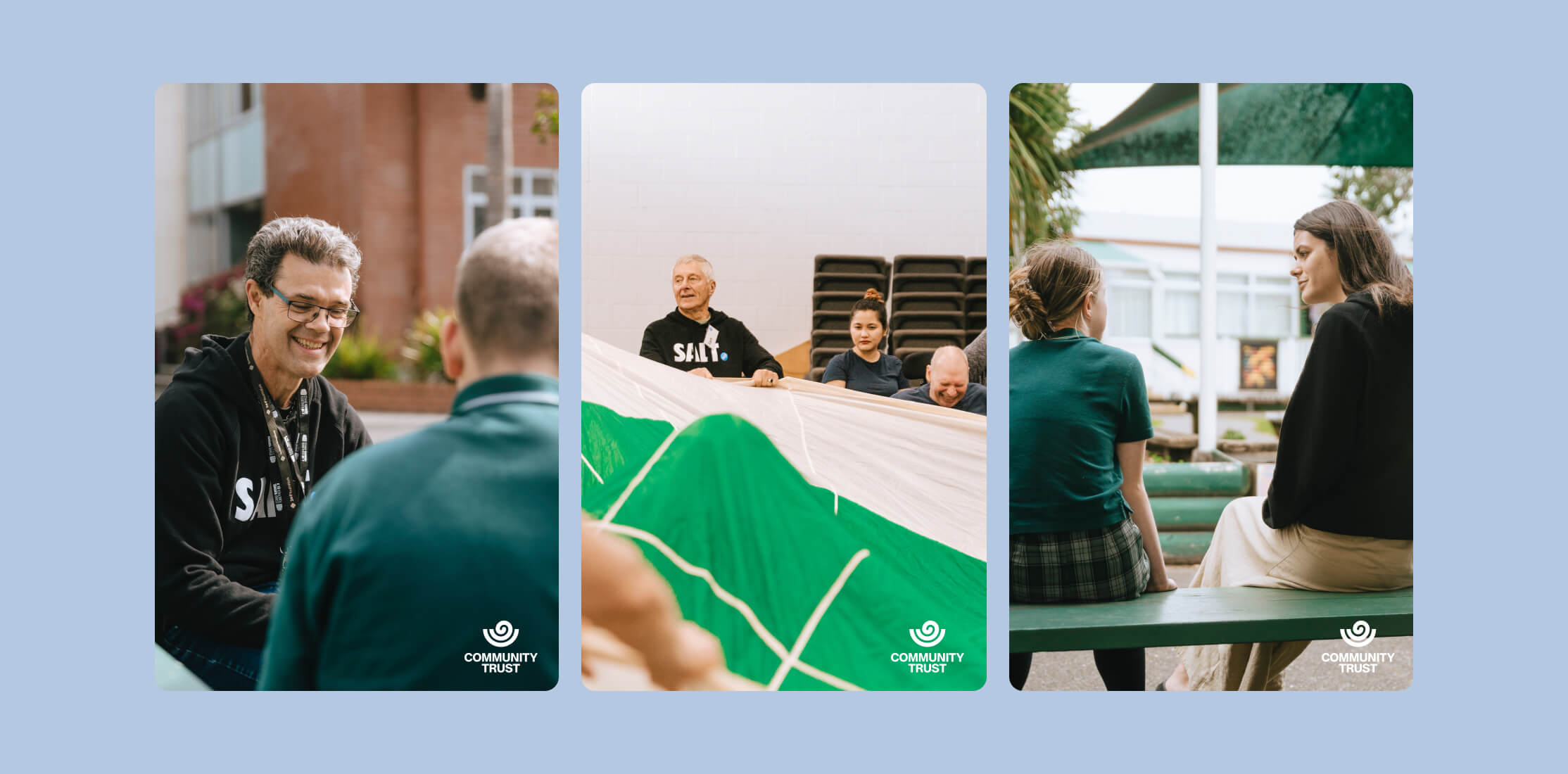
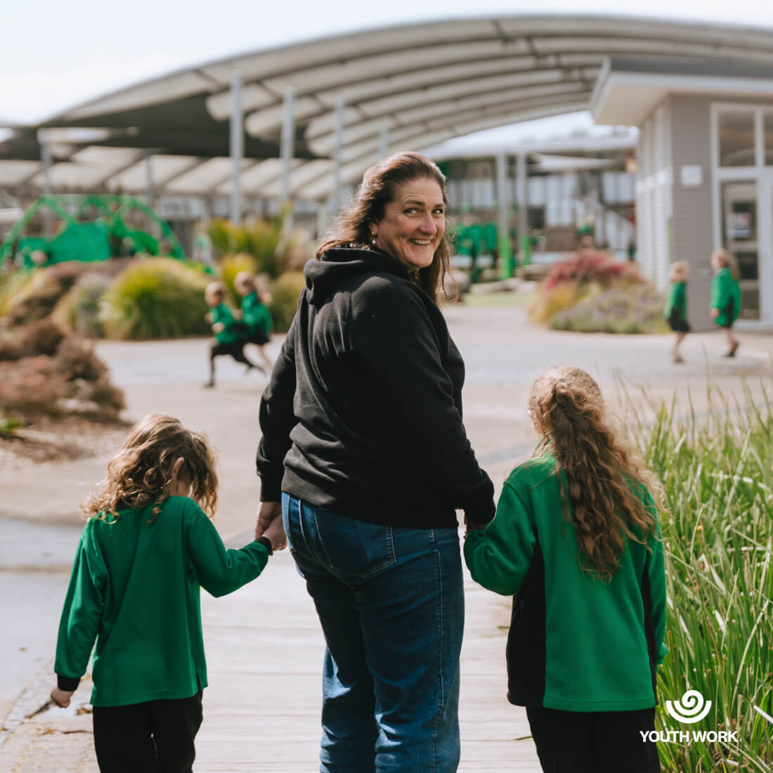
Salt is an organisation very close to our hearts. Their office is opposite ours, and while we design, they feed and clothe our local community in North Auckland. In order to grow their charity and apply for the necessary funding, they were in need of the full treatment: strategy, brand, website, assets.
Our challenge was to create a professional brand that appealed to potential corporate and government donors, without alienating their primary community audience – the community they serve. We settled on designing a typeface logo that was clean, accessible, and modern, which utilised a version of their original blue. However, we paired this with a powerful symbol: a koru in a bowl.
As the fern unfolds, its fluid shape symbolises movement and creation, representing new life and the interconnectedness of all nature. Unfurled, its balanced, circular shape symbolises harmony, strength, and peace – through the unfurling of life, we can still return to the centre and find wholeness.

Salt Community Trust
Ethan and the Dialog team were brilliant to work with throughout the process of our branding refresh and website redesign. They worked to understand our unique needs carefully and then translated that brilliantly into our updated brand and website. They are easy to work with, creative, communicative and talented. After collaborating with Dialog, we now have a brand and website that can confidently take us into the future as we expand our services.