Mute
- Brand Strategy
- Photography
- Web Design
- Copywriting
- Web Development
- Brand Development
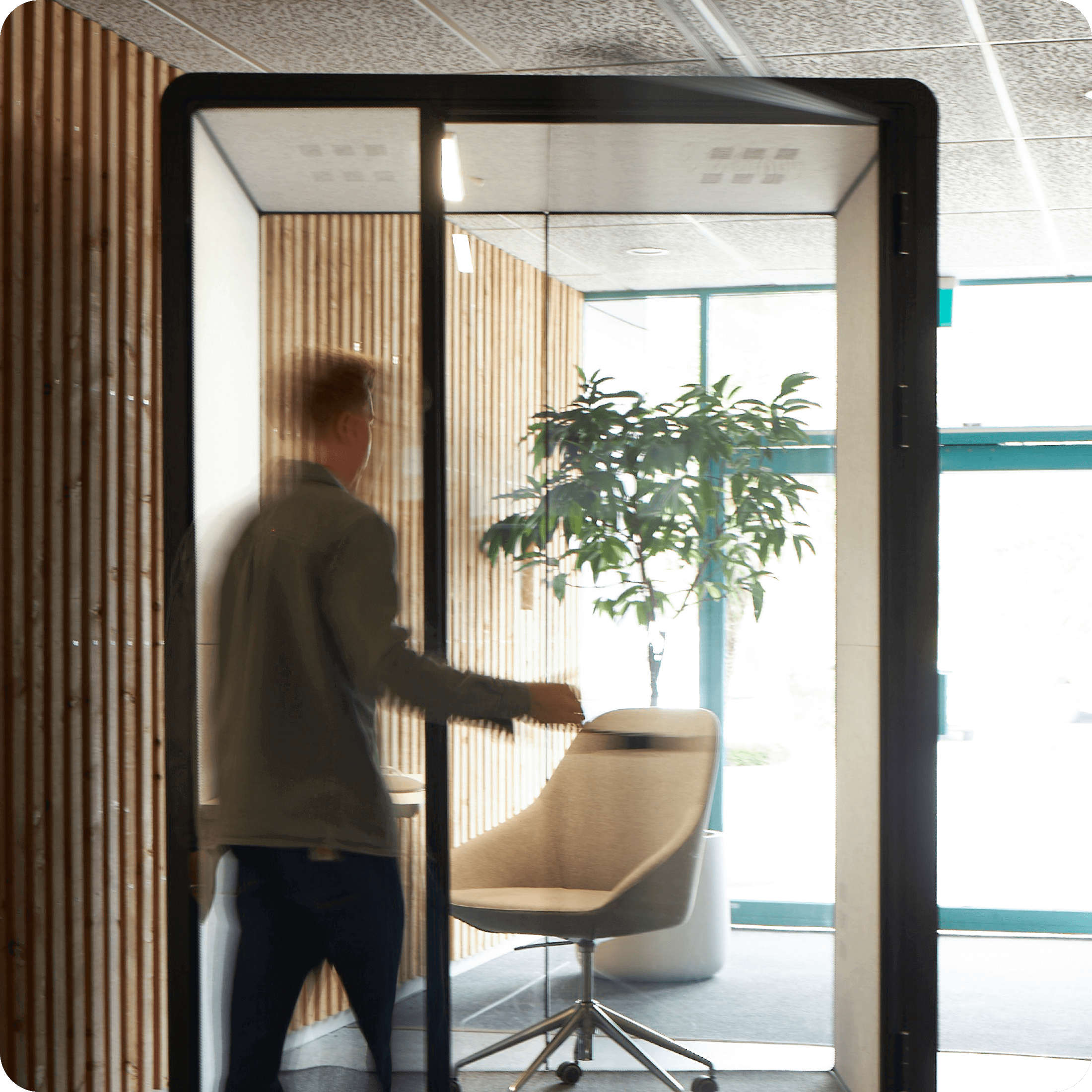
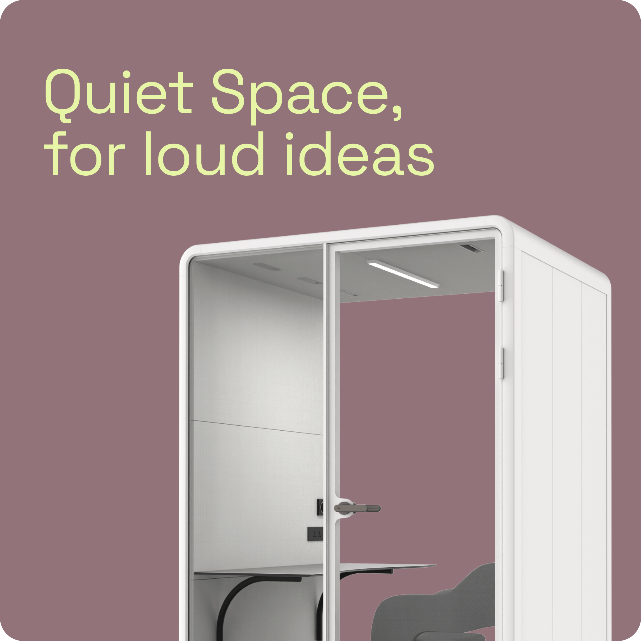
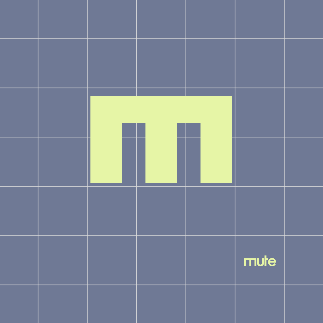
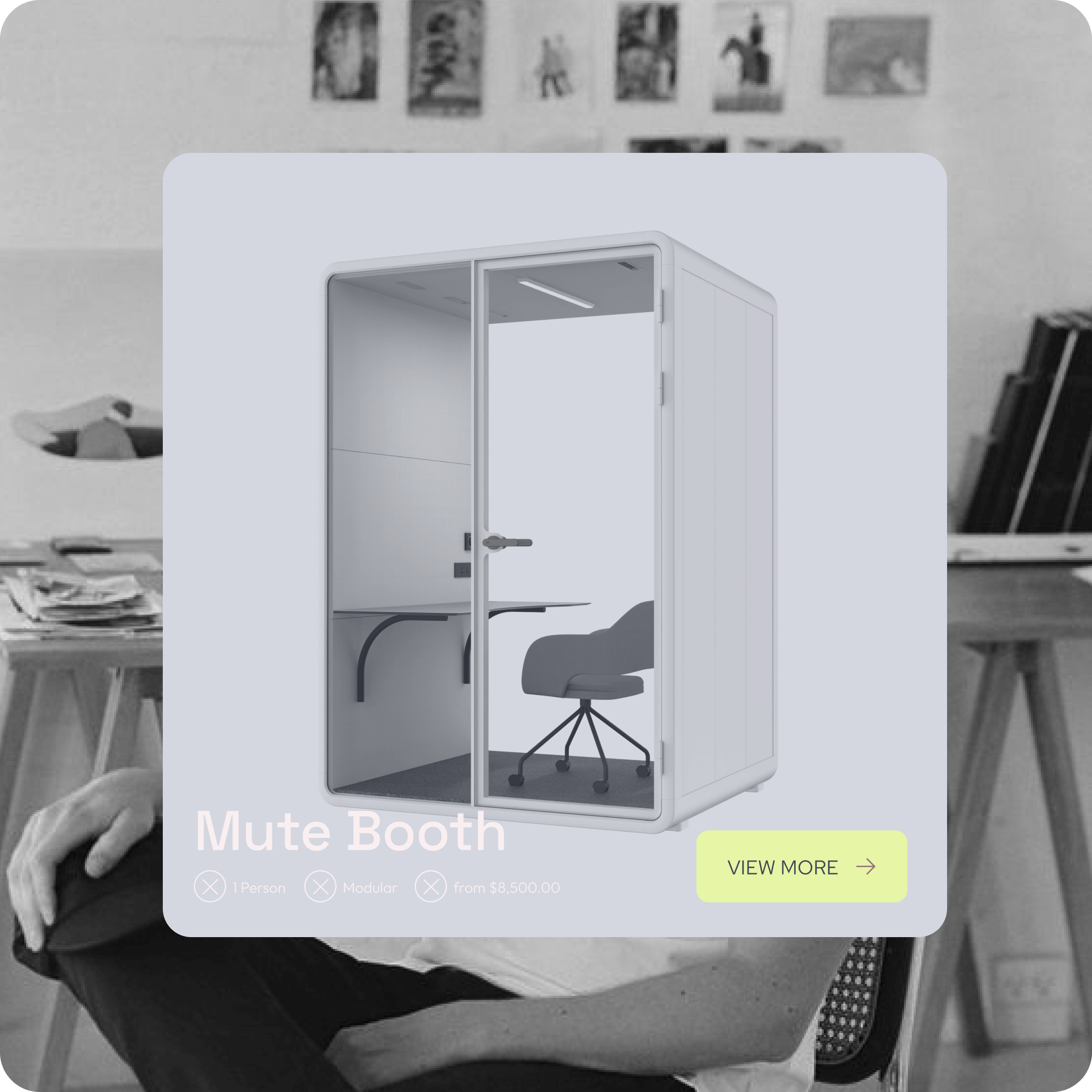
Mute – a boutique office pod provider – came to us looking for a new brand and website. We wanted to create a typeface for their logo that reflected the nature of their business and tone of their name. A lower case, clean, and minimalistic font was the result – it evokes a sense of quiet, while still being punchy and interesting enough to push their business forward in the market. Their website, copy tone, and colour palette also rides that fine line between subtle/soft and professional/contemporary. In the end, Mute walked away with a consistent and modern identity to grow their business around.

Mute
Dialog recently completed branding and a website for Mute. Their dedication to providing an exemplary product, under budget and time constraints, was outstanding. I was continually impressed with their level of communication and regular updates. Not only did we end up with a great website and stylish branding, the team would consistently go the extra mile - even to the point of assisting with our photoshoot.
